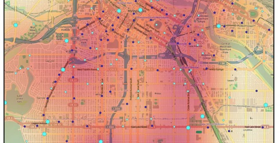
A heatmap from Nice Ride MN’s wikimap
With permission from Melissa at Nice Ride Minnesota, I want to share some maps based on a WikiMapping project called Nice Ride Suggestions. These maps summarize data and focus a person’s attention on trends.
The following images show data exported from WikiMapping into QGIS, an open source GIS. The Open Street Map data comes from the Open Layers plugin. I use several GIS programs, including ArcGIS, Global Mapper, MAPublisher and Manifold, but for the most part I use QGIS with MAPublisher because they both work on the a Macintosh computer and work well for my needs.
The first image shows existing Nice Ride locations in blue and desired locations in orange. Each point contains detailed comments that a project administrator can view in excel, google earth, or gis. As points, the data is a bit overwhelming to the person trying to make sense of it.
So, to make sense of all those points and focus on priority areas, I exported a kml from WikiMapping and imported it into QGIS, a free GIS program and used the heat map plugin.
Here’s the result of the heat map plugin, showing the density of existing Nice Ride Stations in Minneapolis.
Nice Ride Minnesota got input from several hundred users. The data includes very detailed comments. Many locations have multiple comments. If you look at the word “Minneapolis” in the image above and the image below, you’ll see the desired locations relative to the existing ones.
Using QGIS, I zoomed into Minneapolis, added points, and highlighted locations where several people wanted a location. The result is below:
I want WikiMapping Project Administrators to get the most out of their data. My goal today was to demonstrate one way this can be done. This data can be further analyzed by combining it with census data other WikiMapping projects, such as the Twin Cities Bicycle Study or the Hennepin County Bicycle Plan.
If you have questions, please contact me through our contact form.
– Steve


